Top 5 Graphic Design Trends in 2022
Once characterized by trends spanning over a decade, the graphic design industry is now marked by rapidly evolving styles that are changing in a blink of an eye! Ever-evolving advancements through social media, fashion, and technology push graphic design to be one of today’s fastest-changing industries. With trends branching out, exploring, and even returning full circle back to the classics, the possibilities for current trends are endless.
With the help of our Creative Department, we’ve compiled a list of design practices to help you stay on top of the latest industry trends and spark some inspiration for your next project!
1. Retro & Nostalgic Y2K/90s
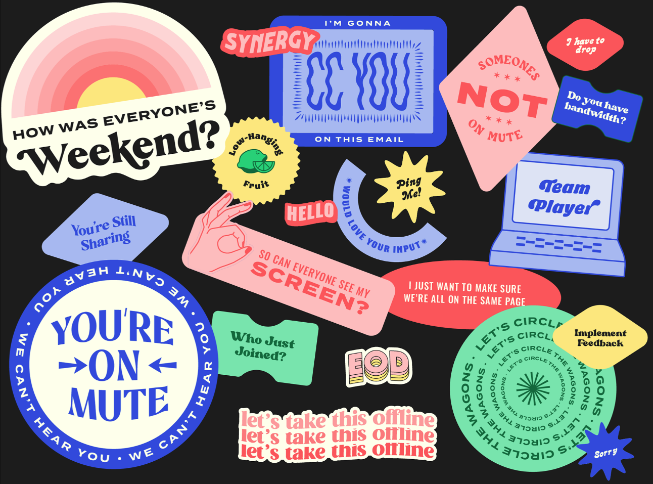
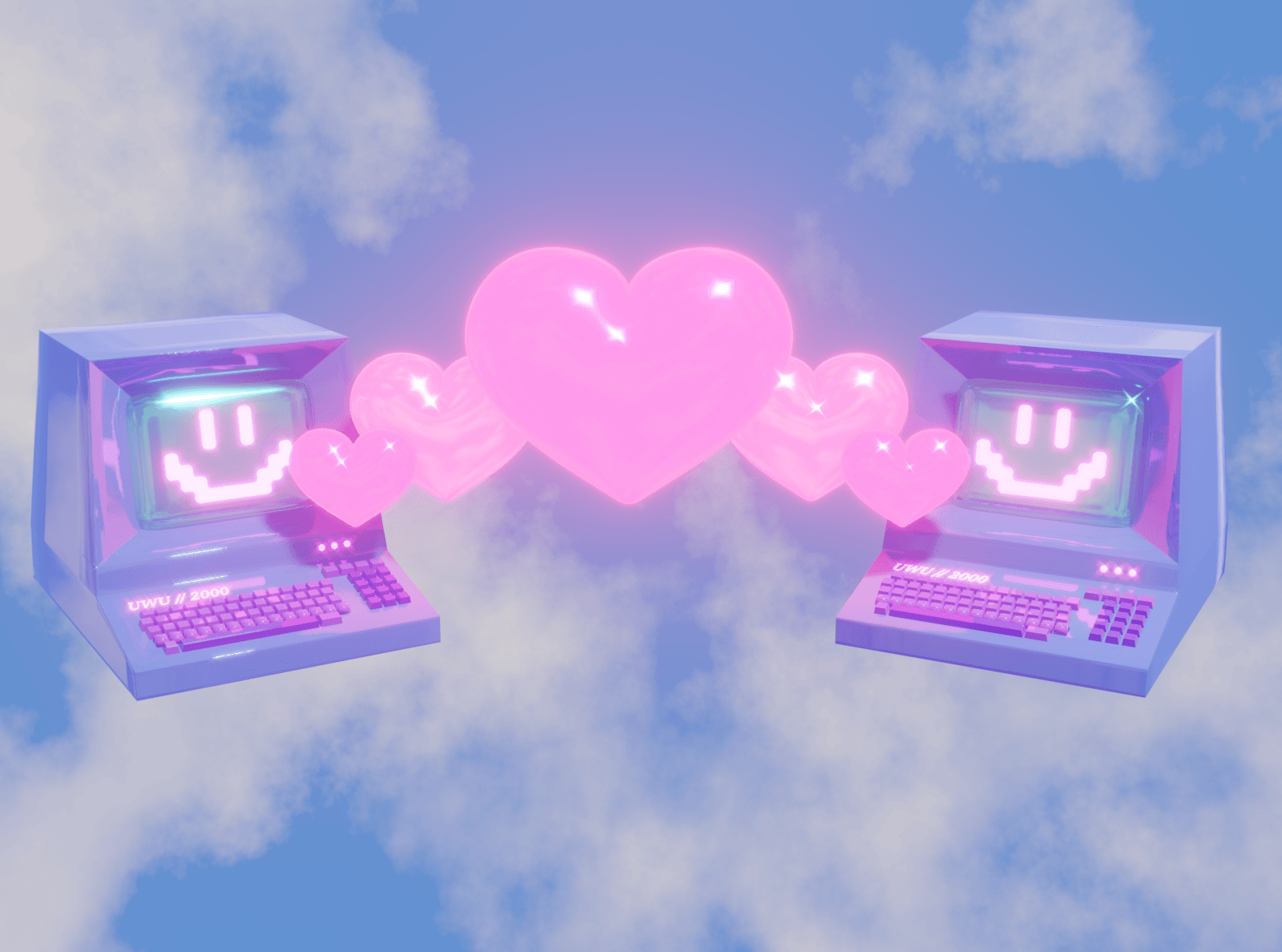
This design style uses an aesthetic associated with “retro styles” of the ’60s and ’70s combined with the early 2000s futuristic, “high-tech” feel. This trend has a few key distinct elements to consider when applying it to your business:
- Bright Colors
- Textures including Chrome/Metallic, Plastic, and Faux Fur
- Icy Blue Hues and Shiny Whites
- Iconography – think sticker packs with smiley faces and butterflies
- Bold and Bubbly Typography
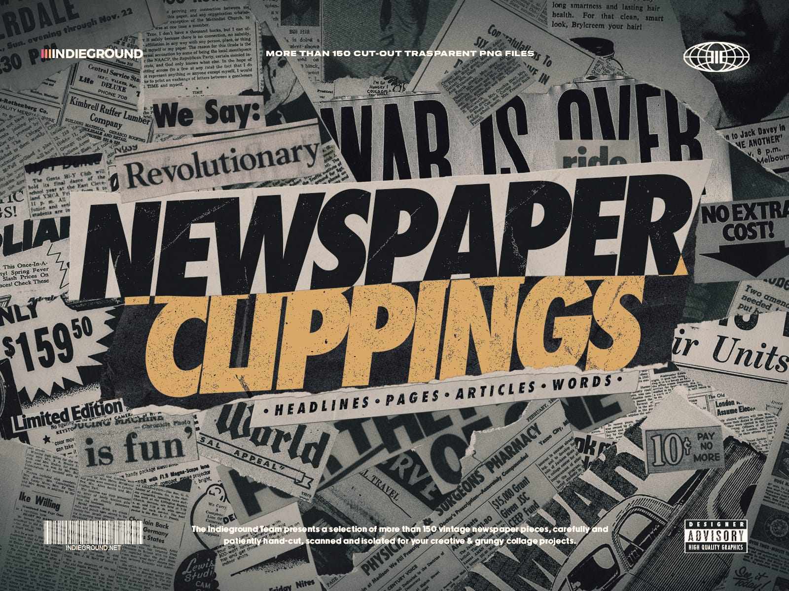
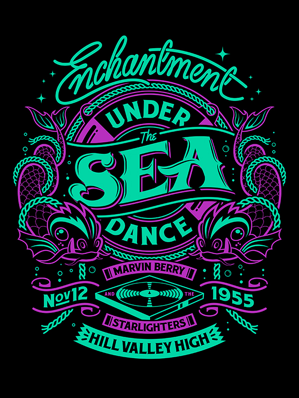
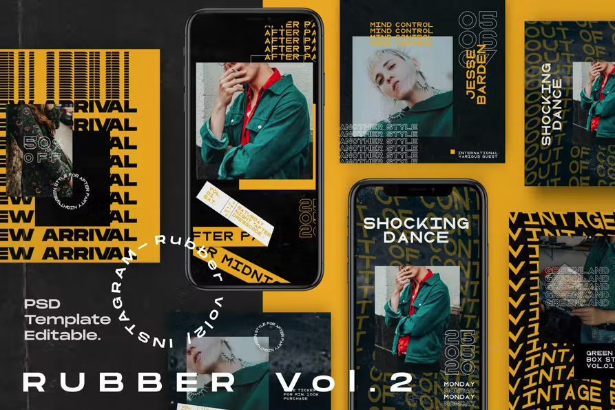
Grunge is also considered a Retro & Nostalgic design style. Highly popular in the 80s and 90s, it is defined by themes of anti-consumerism and counterculture. This style can be identified by its use of glitches, vinyl records, neon lights, and dark colors, primarily black.
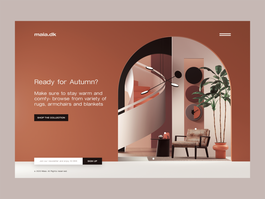
2. Radical Contrast
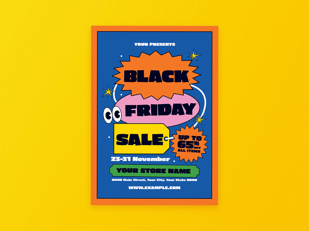
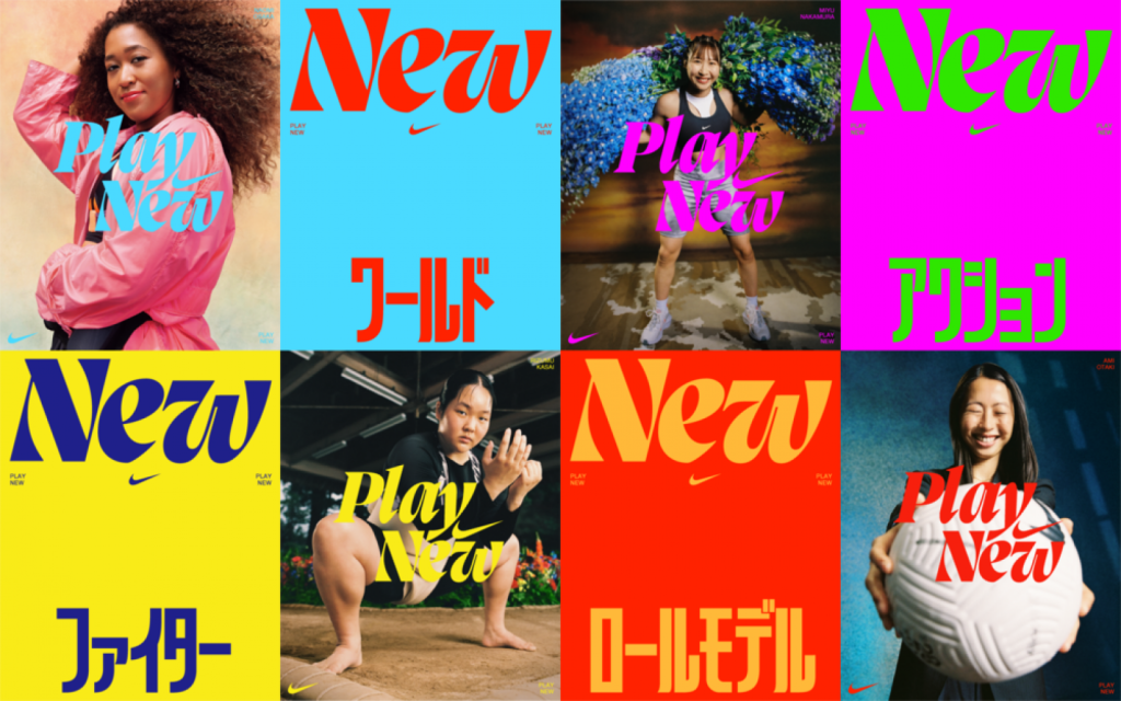
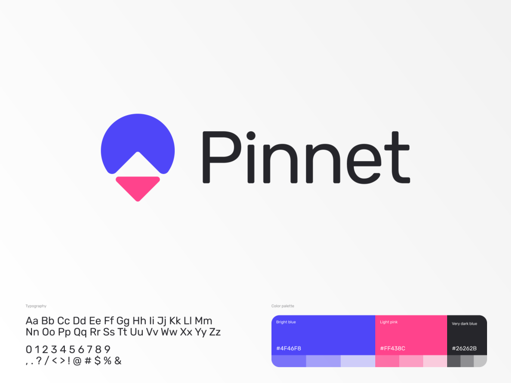
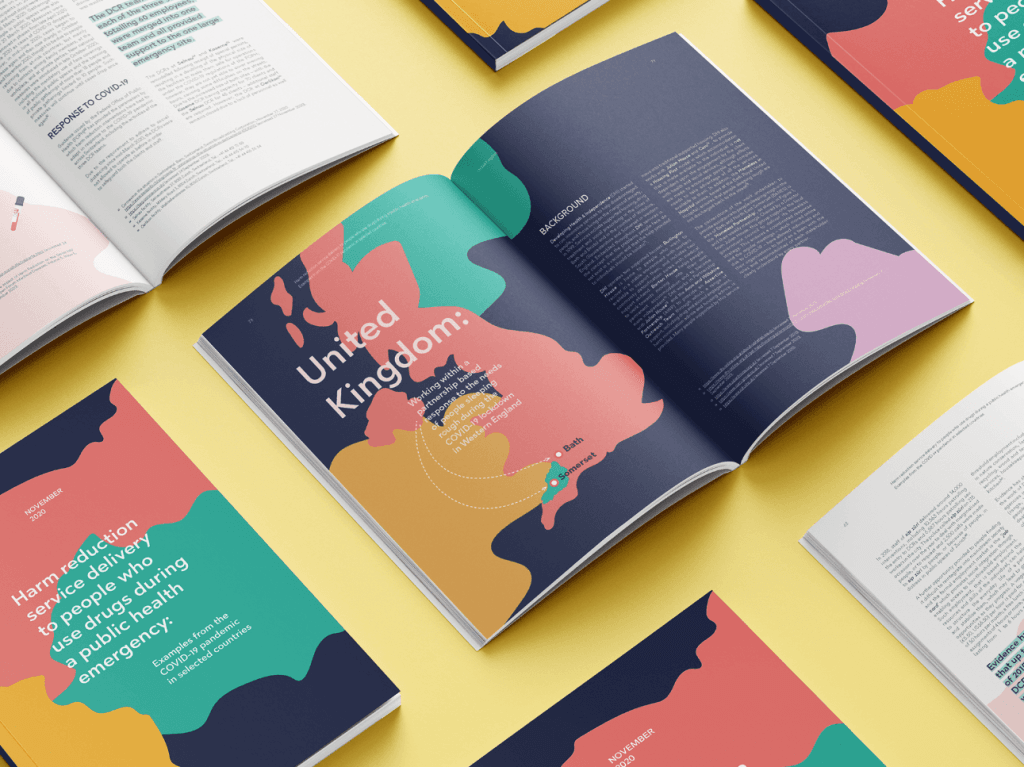
If you’re going for this trend, consider vivid colors that are at opposite ends of the spectrum from one another. Blue and yellow, green and purple – These color pairings might seem odd at first, but once combined, they create an eye-catching design. Think bright, vivid, and bold!
Simplicity is also a key aspect of Radical Contrast, as you should let the contrast between the colors be the main focal point of the design. Adding too many elements or being too busy will overwhelm the viewer and distract from the design’s true message.
Creating a design using Radical Contrast requires both creative expression and mindful design – creative pragmatism if you will. Content that usually does best with this trend includes infographics, reports, or typographical posts.
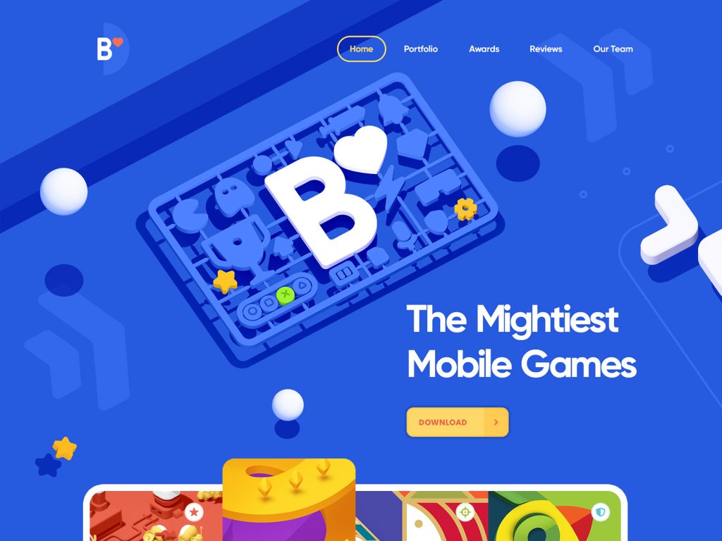
3. 2D Hand-Drawn & 3D Illustrations Combinations
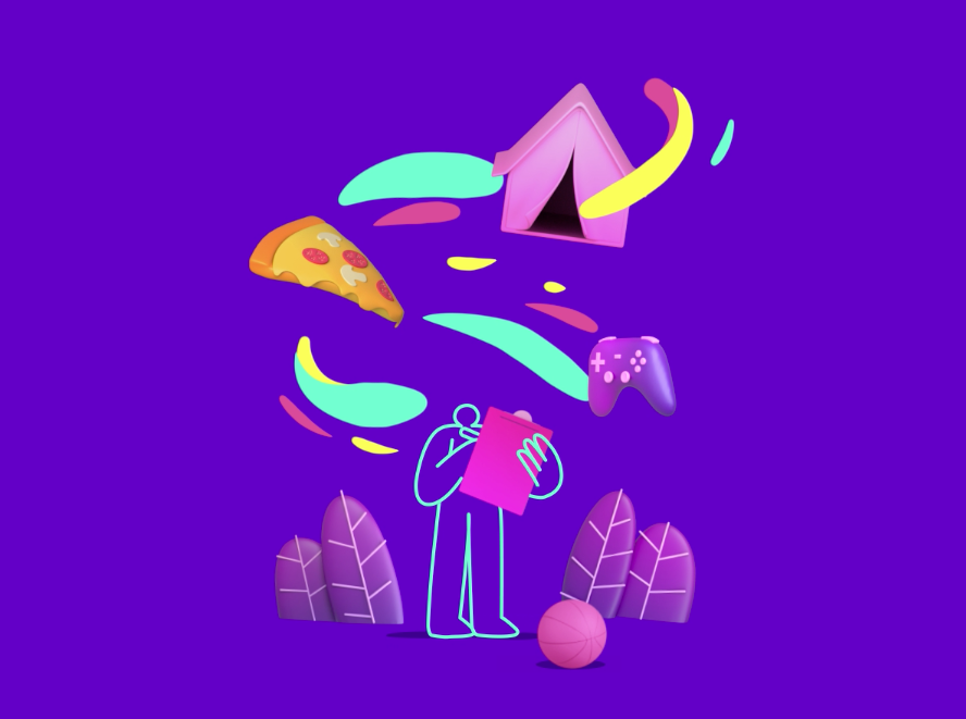
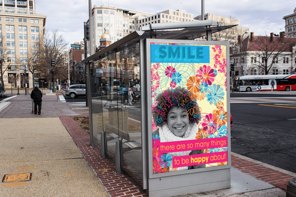
Do you remember when simple, hand-drawn illustrations were popular? Well, they’ve made a comeback, only this time, returning alongside 3D illustrations. The design trend continues to evolve, as designers experiment with both 2D and 3D elements, bringing together the realism of 3D images and the simplicity of 2D drawings.
Other trends, such as radical contrast, can be found as elements within these designs. However, designs that fall within this trend rely heavily on the contrast between the 2D and 3D illustrations to make their true impact.
4. Experimental Typography
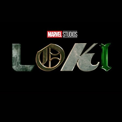
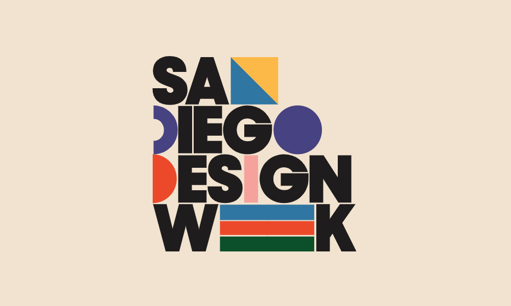
When sitting down to catch the newest episode of your favorite TV show, have you ever noticed the typography used for its title? Experimenting with typography has been one of the fastest trends in recent years, especially within pop culture media! This design element allows creatives to play around with different font styles and shapes. It can be a fun way to tell a story about your brand and leave a lasting impression.
One of the most recent examples is one you might recognize – the iconic title screen for Marvel Studio’s “Loki” series. The multitude of typefaces in their design help lend an element of storytelling to the viewer before the show even begins!
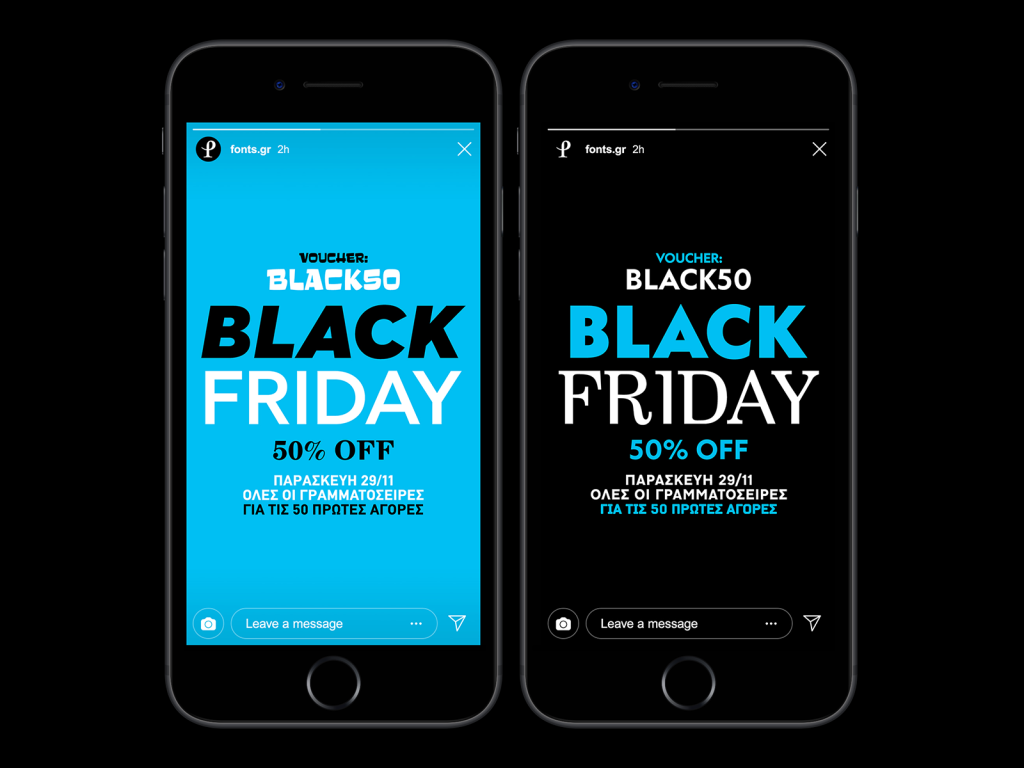
Another popular example of experimental typography is the use of Serif fonts. Due to their distinctive characters of varying shapes, thicknesses, and lengths, alongside their high readability, they make perfect typography to experiment with.
5. Maximalism
There is beauty in simplicity, but there is also beauty in maximalism. If you want to be loud and expressive in your designs, give maximalism a try.
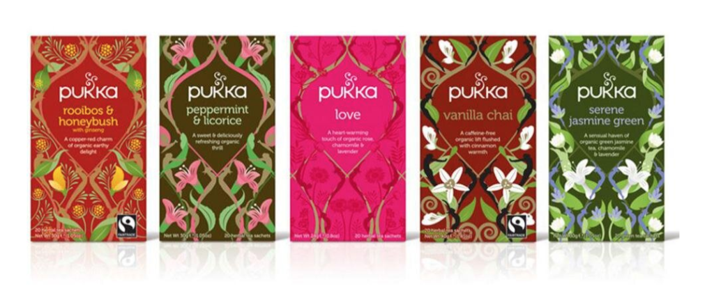
This trend is about ignoring boundaries and conventional styles brought about by minimalist design. While there is a time and place for simple design, more designers have begun expressing their creativity through bold colors, contrasting patterns, and repetitive elements. A characteristic of maximalism is that there is very little white space within its design. Designers are letting their creativity run wild, and we’re here for it!
Don’t Feel Pressured to Follow Every Trend
We know trends come and go, so don’t feel pressured to take on every new trend for your business as it comes. Any trend can act as inspiration. Graphic design is subjective and you, as the designer, have the ability to make these trends something of your own and hone in on your creativity.
See a trend you like, but are unsure of how to implement that design? We can definitely help with that…creative is in our name after all!
About Boost Creative
We are Southwest Florida’s proven design resource for digital and print marketing for over 20 years. Our specialties include corporate identity, advertising campaigns, website development, and content marketing. We also offer a range of other services including marketing consultation, print production, search engine marketing (SEM), and social media marketing. Our team is composed of creative-minded, forward thinkers. With solid multi-industry experience and a foundation in education…we are the real deal. We serve businesses all over the country and are the chosen outsourcing option for many other advertising agencies and marketing consultants. Learn more about who we are.
Interested In Working With Us? Send us a message or give us a call!

The Importance of Website Security
Small businesses are 65% more likely to experience a cyber-attack. Is your website secure? In the age of technology, website...
Finding and Using the Right Marketing Channels
How are customers finding your business? Is it through your website? Are you promoting your products or services through social...
Google Ads 101 - Campaign Types
Search vs Display Campaigns Search Only Ads Search Ads are text advertisements that can appear above or below search results...
